Research Goals
- Understand students’ biggest fears and hurdles with public speaking.
- Identify what motivates learners to practice regularly.
- Gather feedback on prototype wireframes and core flows.
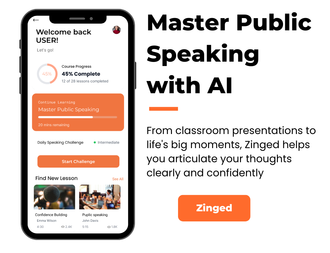
Zinged is an innovative speaking exercise application from a burgeoning startup, currently in development, specifically designed to empower students across grades 3-12 to master confident public speaking. Leveraging advanced AI analysis, Zinged provides personalized, actionable feedback on user speech and integrates it into tailored practice sessions and guided lessons. From comprehensive courses on effective speaking to project-specific support for assignments like book reports and debates , Zinged offers a complete ecosystem to build fluency and confidence for any communication challenge, supported by detailed progress tracking and speech analysis.
I led user research to understand the needs of students, parents, and educators in public speaking. Based on this, I defined user flows and information architecture for core features like courses, practice sessions, and project help. I also designed the AI-powered feedback experience, including speech analysis visuals and personalized practice suggestions. Additionally, I created a vibrant and accessible UI tailored to students across different grade levels.
Zinged is designed to create an engaging, supportive learning environment for public speaking. It features a colorful, friendly aesthetic to make young learners feel comfortable, while maintaining clear, intuitive navigation. Students can easily access lessons, practice activities, and tools for assignments like book reports or debates. A key highlight is the AI-driven feedback system, which uses visual speech analysis to recommend personalized lessons—helping learners improve with confidence and enjoyment.
Students frequently encounter significant anxiety and a lack of confidence when faced with public speaking opportunities, academic presentations, or formal communication in various settings. They currently struggle to find accessible, personalized, and effective tools that provide objective, AI-driven feedback and structured practice, leading to persistent communication challenges that hinder their academic performance and overall personal development.
Survey highlights (n = 45):
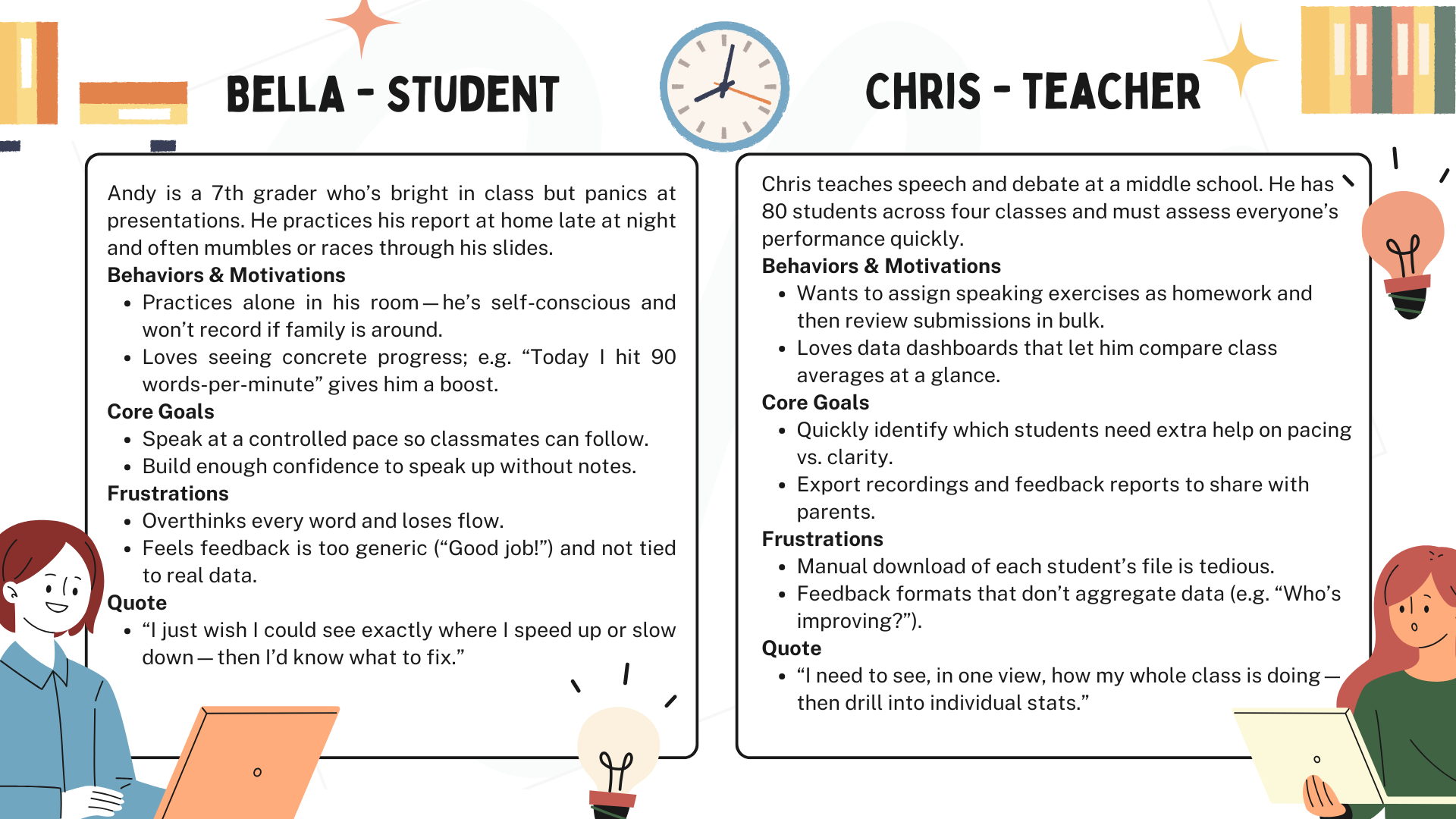
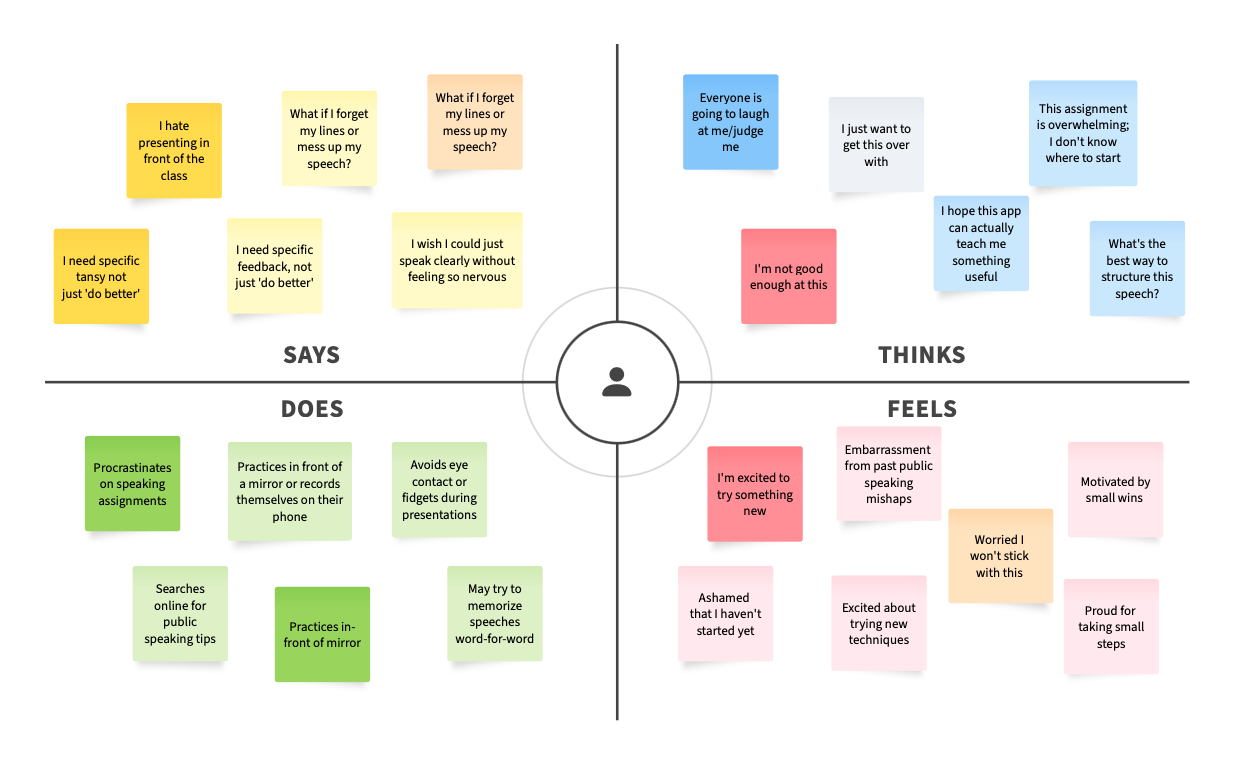
Based on these insights, I refined the onboarding to 2 steps, added gamified badges for milestones, and built a teacher dashboard prototype to streamline progress review.
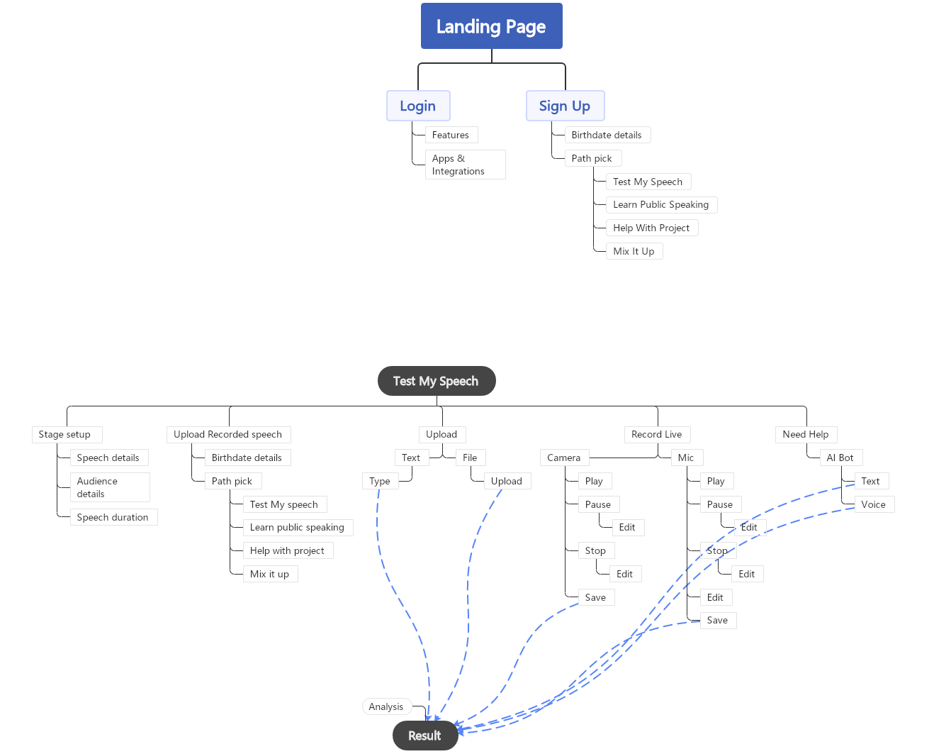
I created a structured and user-friendly sitemap for a public speaking training app that guides users through different interactive learning paths. Starting from the landing and authentication screens (Login, Sign Up, Birthdate), users can choose a learning path such as “Test My Speech,” “Learn Public Speaking,” “Help with Project,” or “Mix It Up.” Each path is supported by detailed flows — for example, in the “Test My Speech” track, users can upload recordings, record live via mic or camera, or get help with scripting and feedback. I mapped out interactions like stage setup, audience selection, and speech duration input, ensuring logical transitions between each task. The flow also incorporates AI-powered feedback tools, with features like speech analysis, editing, and saving progress. This sitemap lays a clear foundation for a modular and personalized user experience, optimizing both guidance and flexibility in the learning journey.
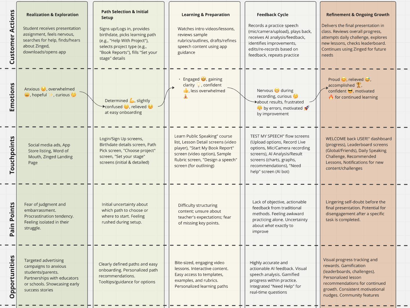
This user journey map visually articulates the student's end-to-end experience with the Zinged app, from initial realization of a public speaking need to sustained confidence and ongoing growth. Divided into five distinct stages—Realization & Exploration, Path Selection & Initial Setup, Learning & Preparation, Practice & Feedback Cycle, and Refinement & Ongoing Growth—the map meticulously details the user's actions, evolving emotions, and critical touchpoints within the app. It clearly highlights key pain points, such as anxiety and lack of objective feedback, and corresponding opportunities where Zinged's features, like AI-powered analysis and structured learning paths, directly provide solutions. This comprehensive overview was instrumental in designing an empathetic, intuitive, and effective learning journey that guides students from hesitation to confident communication.
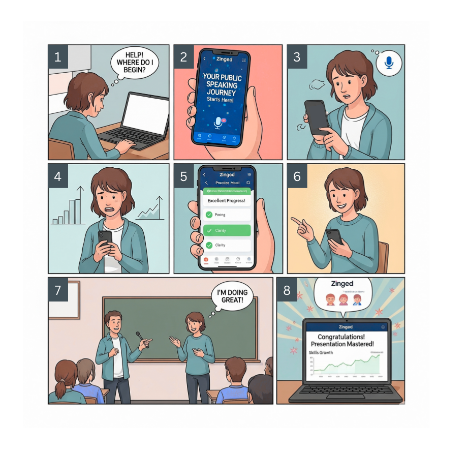
Characters: A student (portrayed with varying gender characteristics across panels to represent a universal user experience)
Overall Story: This storyboard illustrates a student's transformative journey from anxiety and uncertainty about public speaking to confident delivery and mastery, all facilitated by the "Zinged" mobile application.
I created a structured and user-friendly sitemap for a public speaking training app that guides users through different interactive learning paths. Starting from the landing and authentication screens (Login, Sign Up, Birthdate), users can choose a learning path such as “Test My Speech,” “Learn Public Speaking,” “Help with Project,” or “Mix It Up.” Each path is supported by detailed flows — for example, in the “Test My Speech” track, users can upload recordings, record live via mic or camera, or get help with scripting and feedback. I mapped out interactions like stage setup, audience selection, and speech duration input, ensuring logical transitions between each task. The flow also incorporates AI-powered feedback tools, with features like speech analysis, editing, and saving progress. This sitemap lays a clear foundation for a modular and personalized user experience, optimizing both guidance and flexibility in the learning journey.
As part of the LeadYouth app development process, I implemented a comprehensive A/B testing framework to optimize user engagement and conversion rates across the speech training platform. After extensive user research and design iterations, I finalized an orange-dominant color scheme as the primary variant, leveraging orange's psychological associations with energy, enthusiasm, and motivation—key emotional drivers for educational apps targeting youth speech development. The A/B testing strategy compares this energetic orange interface against alternative color schemes including professional blue variants, creative purple options, and calming teal alternatives across critical user journey touchpoints. Key testing focuses include onboarding completion rates, path selection engagement, lesson completion metrics, and long-term user retention patterns. The testing framework tracks conversion rates from sign-up to first lesson completion, average session duration, 7-day and 30-day return user rates, and overall task completion success for speech exercises. My hypothesis centers on orange creating an encouraging, high-energy environment that increases user motivation and drives higher lesson completion rates compared to cooler color alternatives, while also testing different orange intensities and complementary color combinations to identify the optimal balance between engagement and usability. This data-driven approach ensures design decisions are validated through real user behavior rather than assumptions, ultimately creating a more effective learning experience for young users developing their public speaking skills.
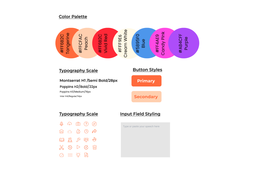
The visual design system for Zinged was meticulously crafted to establish a cohesive and engaging brand identity, crucial for an educational application targeting young learners. It defines a vibrant color palette that evokes energy and approachability, complemented by a clear typography scale that ensures optimal readability across various content types. Core interactive elements like button styles and a consistent iconography set are meticulously defined, alongside standard input field styling. This system extends to a comprehensive component library covering elements such as cards, form elements, and navigation patterns, ensuring design consistency and development efficiency. Furthermore, it incorporates spacing and layout guidelines, data visualization standards for AI-powered feedback, and principles for shadows and motion, all working in harmony to create an intuitive, trustworthy, and visually delightful user experience that supports students in their journey to confident public speaking
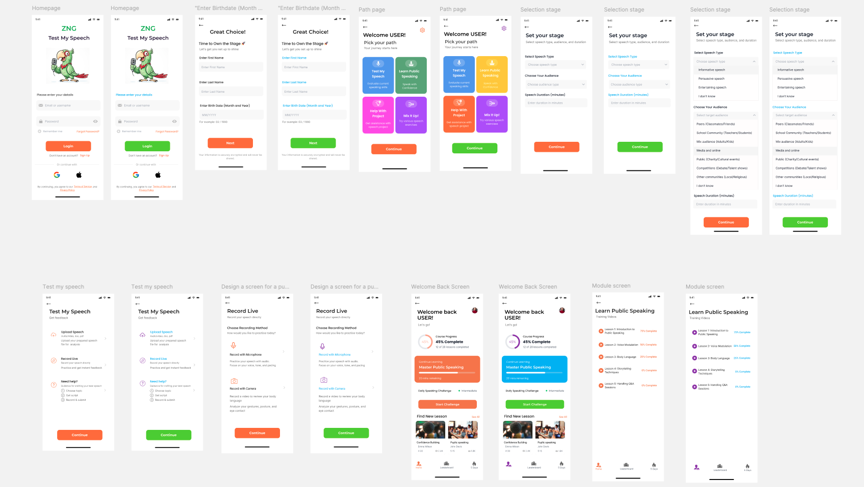
Experience the complete LeadYouth app through this interactive Figma prototype that showcases the full user journey from onboarding to speech practice. The prototype demonstrates key features including the AI-powered speech analysis interface, personalized learning paths, and the intuitive navigation system designed specifically for young learners. Users can interact with the vibrant orange-themed interface to explore different practice modes, view real-time feedback visualizations, and experience how the app guides students through their public speaking development journey. This fully functional prototype validates the user experience design decisions and demonstrates the app's ability to create an engaging, supportive environment for building confidence in public speaking.